K Endorsement Lockup
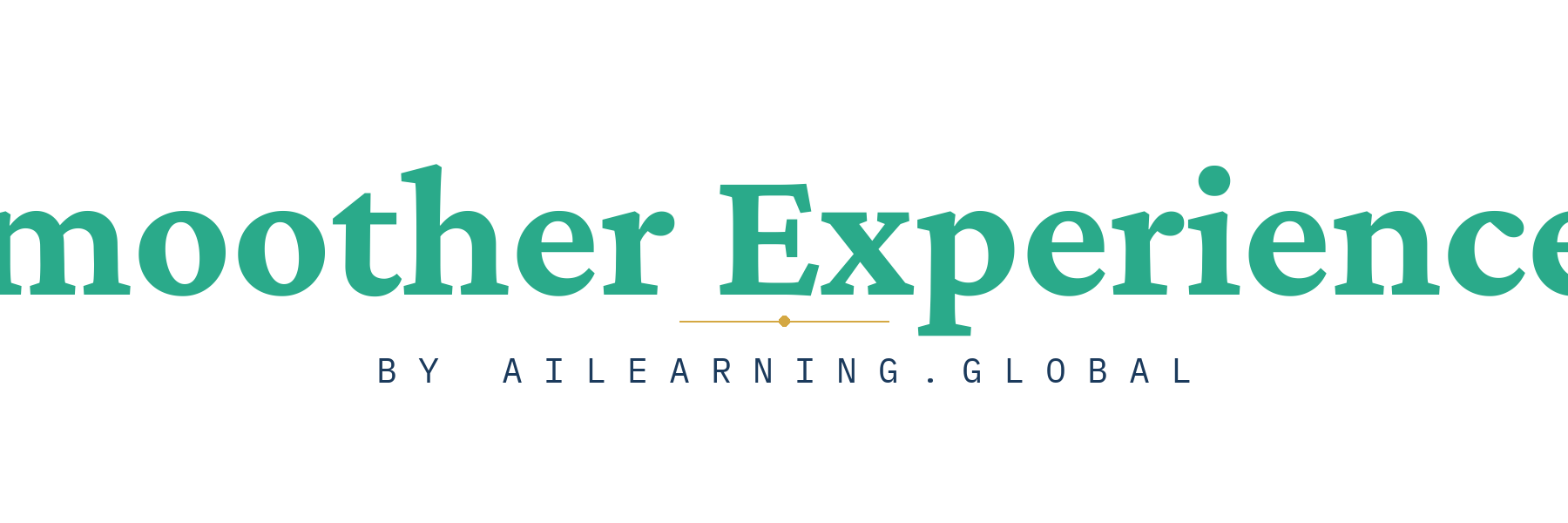
"Smoother Experiences" wordmark in teal serif with a thin gold rule beneath and "BY AILEARNING.GLOBAL" attribution in blue mono — a confident endorsement structure used by mature sub-brands.
Download PNG ↓Concept renderings across both brands — independent directions for AI Learning Global, independent directions for Smoother Experiences, sister-brand experiments, and a newer set treating Smoother explicitly as a product of aiLearning.global. All PNGs are transparent and rendered at 1024×1024 (or wider for lockups). These are concept renderings, not finished artwork — refine the chosen direction via Gemini using the prompts in resources/logo-briefs/ (in the repo, not deployed).
Each logo shows on three backgrounds: light cream, dark blue, and white card — to test how the transparent PNG performs in different contexts.
A second pass on Smoother Experiences that treats it explicitly as a sub-brand of aiLearning.global — not an equal sister. These options use endorsement lockups, the parent color as foundation or enclosure, and dashboard-tile postures. Compare these against the earlier independent-sister set (E–H) to decide whether Smoother should read as a peer brand or a confident product.
"Smoother Experiences" wordmark in teal serif with a thin gold rule beneath and "BY AILEARNING.GLOBAL" attribution in blue mono — a confident endorsement structure used by mature sub-brands.
Download PNG ↓
The Smoother arc held inside a deep-blue ring — the parent color literally encloses the product mark. Reads as "a Smoother experience, inside the aiLearning frame."
Download PNG ↓
A rounded-square deep-blue tile with the teal Smoother arc centered and a faint white "S" in the corner. Designed for a learner's dashboard or app launcher — operational, not aspirational.
Download PNG ↓
A stately serif "S" in teal with a small gold dot in the upper bowl and a thin blue underline. The gold dot rhymes with the parent's illuminated-initial "A"; the blue underline acts as the parent thread.
Download PNG ↓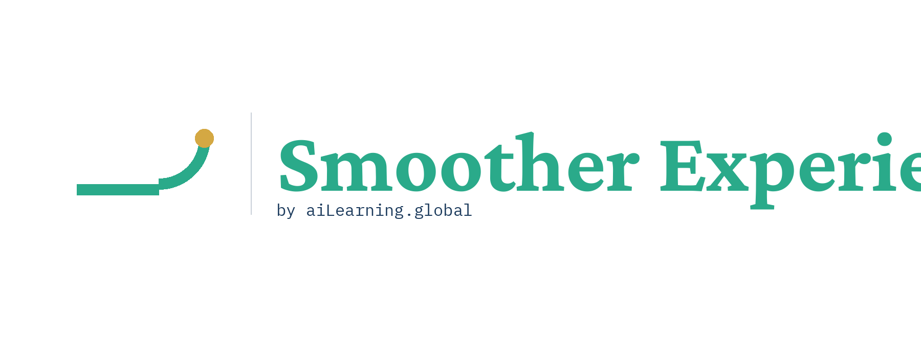
The Smoother arc mark sits to the left of the "Smoother Experiences" wordmark with a "by aiLearning.global" attribution beneath. A thin blue rule divides mark from text — the canonical co-branded form.
Download PNG ↓
A teal wave rises from a flat deep-blue foundation line with a gold dot at the apex; "Smoother" sits beneath in blue serif. Pedagogical narrative: the parent is the foundation, Smoother is the rising experience.
Download PNG ↓
A stately serif "A" with a single gold dot inside the negative space — a contemporary marginal mark on a classical letterform.
Download PNG ↓
Five gold dots on a deep blue field, connected by thin lines tracing the letters "ai". Reads as both a star pattern and a monogram.
Download PNG ↓
Two arcs in blue and gold meeting to suggest a third ascending form. Architectural, abstract. AI as augmentation, not replacement.
Download PNG ↓
A bold serif "a" with a small gold asterisk to its upper right — a primary letter completed by a scholarly footnote.
Download PNG ↓
Pure typographic treatment. "aiLearning" in stately serif with "· G L O B A L ·" in gold mono beneath.
Download PNG ↓
A flat line rising into a quarter-arc, with a gold dot at the apex. A pathway walked smooth by attention.
Download PNG ↓
Three concentric arcs — blue foundation, teal progression, gold mastery. Pedagogical depth without resorting to charts.
Download PNG ↓
A stately serif "s" in teal with a small gold dot at its upper terminal. Wordmark-leaning. Works as monogram and as the first letter of "Smoother".
Download PNG ↓
A rough blue stroke and a smooth teal stroke meeting at a single gold point. Visualizes the early-to-mastered learning arc.
Download PNG ↓
Pure typographic treatment. "Smoother" in teal serif with "· E X P E R I E N C E S ·" in gold mono beneath.
Download PNG ↓These two test whether the brands should share a mark, adapt one, or stay distinct. Wider format because they explore the relationship rather than a single mark.

A single mark designed to serve both brands — a chalice opening upward toward a gold apex. Would sit above either wordmark.
Download PNG ↓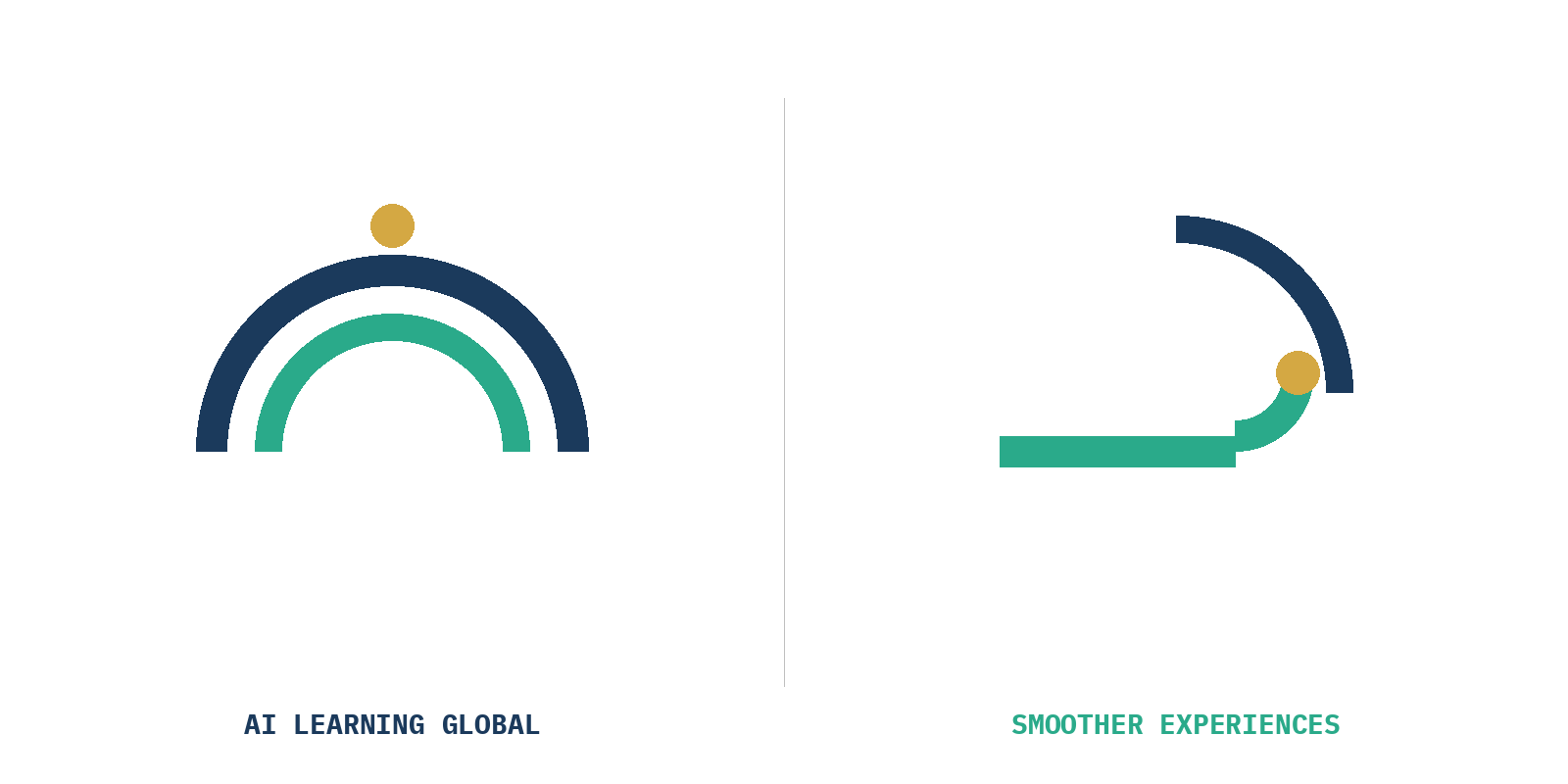
Same geometric DNA, different orientation: vertical ascending arcs for AI Learning, horizontal path-to-apex for Smoother. Same family, distinct identity.
Download PNG ↓Pure typographic treatments — what each brand looks like with no symbol at all. Often the right move for a confident brand.
Pure typographic treatment. "aiLearning" in stately serif with "· G L O B A L ·" in gold mono beneath.
Download PNG ↓ Pure typographic treatment. "Smoother" in teal serif with "· E X P E R I E N C E S ·" in gold mono beneath.
Download PNG ↓